The blog from


10x Notable Logo Updates for 2013
2013 has been an interesting year for logo updates.
Keep the old logo? Throw it away and start again? Or evolve what you’ve already got?
2013 has definitely been the year of the ‘brand refresh’ – businesses are falling over themselves to tidy up and update their logos. So what’s behind all this? For certain, these logo changes reflect deeper changes within the businesses rather than just a fresh lick of paint.
Here are 10 examples of logo evolution in 2013 and some thinking about why they’ve changed…
![]()
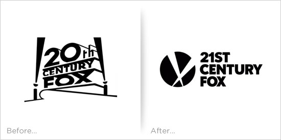
You can just imagine the conversation at 20th Century Fox HQ when somebody pointed out that their name was out of date… The searchlights are still there but the name and the typography move into the 21st century.
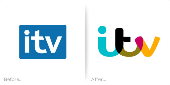
![]()
A refresh or a new logo? Either way, it’s quite neat and the implementation is fun and colourful.
![]()
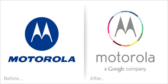
The Motorola ‘M’ is still there but the typography grows up and there’s a splash of colour. The reason for the change? You might need to Google that…
![]()
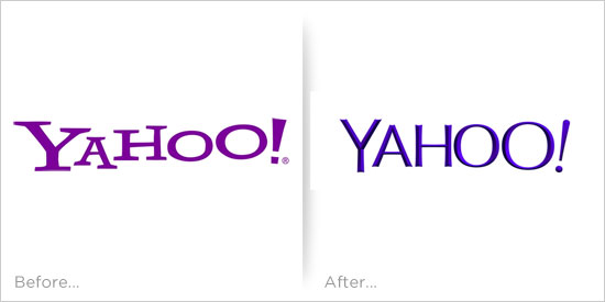
Not the best example of a brand refresh! Poor old Yahoo seems to be trying everything to get themselves back into the market – but this logo update probably won’t make much of a difference. I think I prefer the old version!
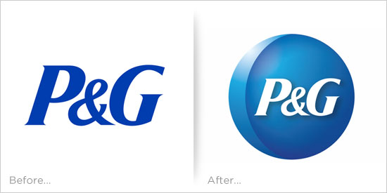
![]()
P&G look back to their roots as they reintroduce a silver moon motif into their brand. Not sure quite why – maybe it was to justify the circular logo which seems to be so popular at the moment.
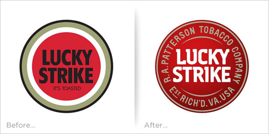
![]()
Oooooh no! Woe betide the brand manager who plays around with a design icon like the Lucky Strike brand! This logo should have been left as it was…
![]()
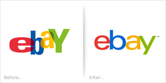
The eBay logo refresh is a perfect example of how to use typography to successfully remove any personality from a logo. Boring, boring, dull.
![]()
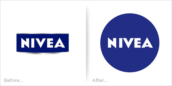
Nivea have been using their existing logo since 1925 and have now moved to a blue circle. This small change reflects the brand’s early days when creams were sold in round tins with blue lids and the word ‘Nivea’ written on the top. Nice story but probably lost on most people!
![]()
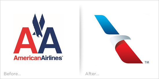
Now this is a nice example of brand evolution. The old eagle takes to the air in the shape of an aircraft’s tailplane. Clever.
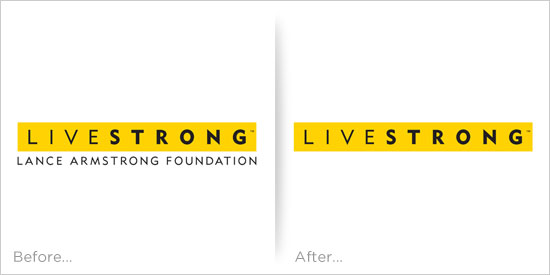
![]()
And finally… Spot the difference with the Livestrong branding? Proof (if needed) that a small change to a logo can signify a major change within an organisation.
.

©2005-2014 Wisetiger
Start the conversation