The blog from Wisetiger.
Insight, ideas and informed comment. We've earned our stripes... www.wisetiger.co.ukRecent Posts
- Measuring bricks with bits: analytics for the real world
- Learning to love the robot: why you should automate your marketing
- The Essential EU GDPR Guide
- Mobile Killed the Television Star | Wisetiger
- Is Native Advertising a Good Thing? | Wisetiger
- 7 Web Design Trends for 2017 | Wisetiger
- Digital Marketing Trends for 2017
- Mobile is the best channel for targeting students
The blog from Wisetiger.
Insight, ideas and informed comment. We've earned our stripes... www.wisetiger.co.ukSearch stripey
Categories
Don’t be Afraid of the Fold
The “fold” is a term often used to describe the point on a web page where users have to scroll to see more information. In the distant past, before mouse wheels, there was a tendency to squash content above the fold and to try to eradicate scrolling as much as possible. To this day it can still be a concern for those commissioning websites. It needn’t be.
In reality, the “fold” is different for everybody. It’s position can depend on many factors including, screen size, window size and browser add-ons. It’s virtually impossible to make everything above the fold for everyone – and, it turns out, website visitors really don’t mind scrolling. A study of user activity across 120,000 web pages found that 76% of users scrolled, and a good proportion of the scrollers even made it all the way to the bottom of the page.
A study of user activity across 120,000 web pages found that 76% of users scrolled
Here at WiseTiger we haven’t completely disregarded the fold altogether – we just aren’t afraid of it. It’s still important to ensure that our clients’ most important information is placed as high up the page as possible. For example, If your users have to scroll to find the main navigation, they’ll soon get fed up and leave. A great homepage needn’t be crushed to fit a mythical boundary.
Next we’ll look at a great looking, functional site that has no problem with asking it’s visitors to scroll.
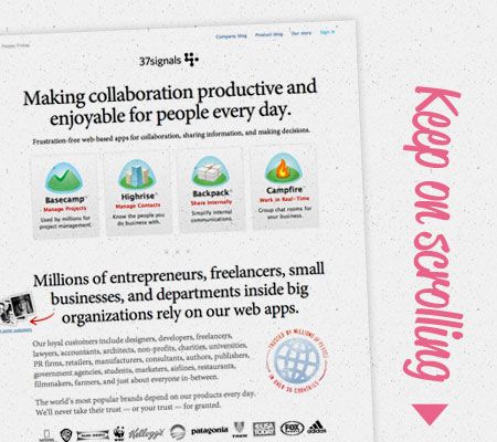
Keep on scrolling
www.37signals.com is a great example of embracing the fold, or to be more accurate completely ignoring it all together. One of the advantages of the “long home page” for the reader is that no further navigation is required – all the good stuff is already there in one place.
37 Signals have worked hard here to avoid intimidating the reader with acres of text filling all this space. The large headings in serif type not only break up the page into easier-to-digest sections but also encourage further exploration, tempting the reader to keep on scrolling. The designers have also ensured that important statements and navigation are available at the top of the page and also for those brave scrolling souls who made it to the footer.
I love the fact that 37 Signals have managed to create a lively but business-like homepage without using hundreds of images or gimmicks – it’s simple and it’s stylish. And yes, I scrolled all the way to the bottom!
WiseTiger’s top tips:
- Always keep important information, such as, navigation, contact details and positing statements at the top of the page
- Use clearly divided sections to help users find the information they need – users tend to scan not read
- Think about lively and interesting content throughout the page – reward those scrollers!
- Don’t worry about cramming content to reduce scrolling – visitors really don’t mind!
Simon Verrall
©2005-2014 Wisetiger


Start the conversation