The blog from Wisetiger.
Insight, ideas and informed comment. We've earned our stripes... www.wisetiger.co.ukRecent Posts
- Measuring bricks with bits: analytics for the real world
- Learning to love the robot: why you should automate your marketing
- The Essential EU GDPR Guide
- Mobile Killed the Television Star | Wisetiger
- Is Native Advertising a Good Thing? | Wisetiger
- 7 Web Design Trends for 2017 | Wisetiger
- Digital Marketing Trends for 2017
- Mobile is the best channel for targeting students
The blog from Wisetiger.
Insight, ideas and informed comment. We've earned our stripes... www.wisetiger.co.ukSearch stripey
Categories
And the colour to watch out for in 2015 is…
It’s that time of the year again when the world looks forward to what might (or might not) happen next year!
As Creative Director one of my pet topics is colour. And as luck would have it the good people at Pantone® have a team of professionals whose business it is to predict colour trends! And it’s big business too. In the world of fashion and interiors, getting colour right can be the difference between success and failure. And in branding and marketing too, getting colour right can have a serious knock-on effect.
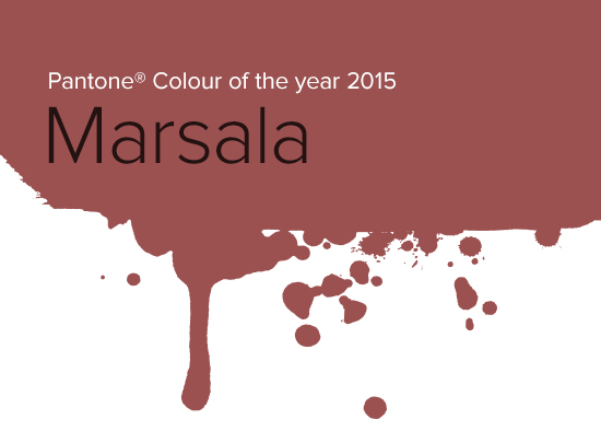
Which brings us to the Pantone® Colour of the Year 2015. It’s 18-1428 “Marsala”. And I have to say, it’s very nice too.
According to Leatrice Eisema at The Pantone Colour Institute “Marsala enriches our mind, body and soul, exuding confidence and stability. Marsala is a subtly seductive shade, one that draws us in to its embracing warmth”.
And she’s right. This colour is very tasteful, sophisticated and naturally earthy. It’s equally appealing to men and women, goes well with a range of other colours and can be used for dramatic effect (when used in large volumes) or as a secondary colour where appropriate. This colour would work equally well in corporate and B2C use.
So watch out for Marsala in 2015. There’s a very good chance you’ll see it soon!
Simon Verrall
©2005-2014 Wisetiger


Start the conversation