The blog from


Business Brand Colour Trends for 2012
As we approach the end of the year it’s time to predict some colour trends for the next twelve months.
This time last year I predicted that business colour trends for 2011 would be muted and subtle. Business confidence was ok, but many companies remained conservative and opted for safe colours rather than vibrant hues. There were exceptions, but for most businesses colour schemes were pretty ordinary.
Blue is the new Blue!
No surprises here; blue is the UK’s favourite corporate colour. If you want to know more about business brand colour theory, read this fascinating research document by Leeds University which monitored the use of colour amongst the top FTSE brands. They found that “blue is the most popular corporate logo colour, with 49% of FTSE 100 companies using blue for their logos”. And it’s the same story right the way down the pecking order, with more businesses choosing blue than any other colour. Expect blue to remain popular during the next year…
Green shoots?
The most interesting development we’ve noticed in corporate colour schemes is the emergence of green. Green hasn’t traditionally been a popular colour choice for business, but as we go into 2012 I predict we’ll see a lot more of it. In days gone by, green was associated with hippies, herbal tea and ‘green politics’ – not the colour of ‘serious’ business.
But green has grown up. And what a great choice of colour to reflect business confidence as we emerge from the recession. Are you seeing the green shoots of recovery? Then why not use green in your logo! It’s positive branding and it makes good business sense.
And let’s not forget that green is the colour of environmental consciousness. Being ethically and environmentally aware has become an important driver for brand reputation, so it makes good business sense to be seen to be green. And what better way of doing this than adding green to your logo or colour palette?
Here’s a great example…
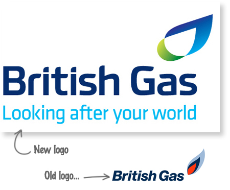
![]()
The British Gas logo is an example of green appearing as part of a brand refresh. In this latest iteration of the British Gas logo the red of the flame has been removed from the identity. Keen eyes will notice new typography and a new strapline, but for me the most important change is the appearance of green.
When I was a small boy, my mother told me “have your greens, they’re good for you”. Let’s see if she was right!
.


©2005-2014 Wisetiger
Start the conversation