The blog from


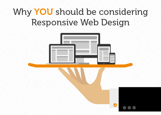
Why YOU should be considering Responsive Web Design
Responsive Web Design is a website design approach which optimises content for easy viewing with minimal page resizing, scrolling and panning, across a wide range of devices from mobile phones and tablets to laptops and PC desktops.
But is it necessary or just a nice to have?
Adobe has recently released its latest Digital Index which looked at some of the most successful websites in the world and identified what set them apart from their counterparts. Those websites who had adopted Responsive Design were seen to be significantly pulling away from the competition, particularly in the UK.
The report revealed that UK sites see the highest proportion of traffic from smartphones and that websites that are optimised for smartphone visitors generally see 60% difference in share of smartphone traffic than an average site.
Who are smartphone users?
Smartphone users love email, search, and social media and are more likely to explore new sites. Creating a relevant and navigable smartphone experience is vital to gain and retain customers.
Smartphone users:
- Search more than other visitors
- Are more likely to open email links
- Do more opportunistic browsing
Source: ADOBE DIGITAL INDEX | Best of the Best Benchmark (EUROPE) – 2014
But Responsive Web Design isn’t just about smartphones, and UK sites also receive the highest number of tablet traffic than any other country. Tablet users are known to be affluent, open to purchasing online and lovers of new technology, so not optimising for this device could be a missed opportunity for many brands.
Who are tablet users?
Tablet users are more affluent and among the most gadget-orientated consumers. They tend to use their tablets at home, often instead of their computers.
Tablets users:
- Enjoy rich media experiences and videos
- Spend more money on retail and travel sites
- Are easily frustrated by technologies that don’t work on tabs
Source: ADOBE DIGITAL INDEX | Best of the Best Benchmark (EUROPE) – 2014
Remember also that ‘Responsive Design’ is not just about the website looking good on a smartphone or tablet, it’s also about it being more useful. A customer viewing your website on their mobile (and therefore quite possibly mobile themselves) will be looking for different information (usually more actionable information) compared to a desktop viewer.
And if you are not yet convinced, here are three more reasons why you should consider switching to a responsive website:
1. Mobile usage is on the up
Last year 40% of mobile phone users made a purchase using their phone (source: Google), over 20% of all Google searches were made on a mobile phone (source: Smart Insights) and over 60% of people had a better opinion of a brand when they had a good mobile browsing experience (source: Smart Insights).
2. Responsive Websites improve your SEO
In 2012 Google’s Pierre Farr said that Google prefers responsive web design to mobile templates and therefore, those responsive websites perform best in Google searches.
3. Responsive Websites are future proof
Because responsive design is based on screen size not device, your website will be ready for any future screen-sized device that is introduced to the market.
You can read the whole of Adobe’s 2014 Digital Index here.
©2005-2014 Wisetiger
Start the conversation